簡単な設定でリッチなアニメーションやカスタマイズが可能なモーダルウィンドウのjQueryプラグインiziModalをご紹介します。
ライセンスはApache License 2.0です。
サンプル
ファイルの準備
必要なファイルを読み込む
配布元のサイトからjsとcssデータをダウンロードして、html内で読み込みます。
必要なファイルはダウンロードデータの以下に格納されています。(2016年9月現在)
iziModal-master
├ css
│└ iziModal.min.css
└ js
└ iziModal.min.js
<link rel="stylesheet" href="iziModal.min.css">
<script src="https://code.jquery.com/jquery-2.2.4.min.js" type="text/javascript"></script>
<script src="iziModal.min.js" type="text/javascript"></script>
デフォルトの使い方
html
1行目はモーダルウィンドウを表示させるためのボタンです。
クリックした時のイベントを起こすためのクラス名open-defaultを指定します。
2〜7行目はモーダルウィンドウの中身です。
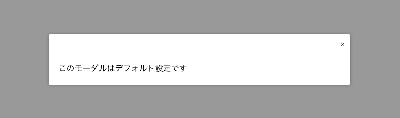
全体を囲うブロック要素にid modal-defaultを指定します。
3行目は、デフォルトのままでは表示されない閉じるボタンを入れています。
<button class="open-default button">default</button>
<div id="modal-default">
  <div class="close">
    <a data-izimodal-close="">×</a>
  </div>
  <p>このモーダルはデフォルト設定です</p>
</div>
js
1行目でhtmlのモーダルウィンドウ表示ボタンに設定したクラス名open-defaultを指定します。
3,5行目でモーダルウィンドウの中身に設定したid modal-default を指定します。
$(document).on('click', '.open-default', function(event) {
  event.preventDefault();
  $('#modal-default').iziModal('open');
});
$('#modal-default').iziModal();
オプションを使用した使い方
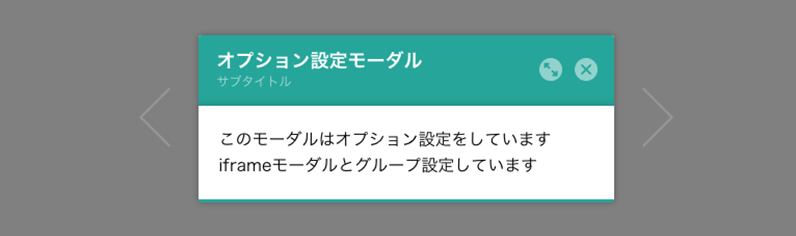
オプションを使用するとモーダルウィンドウのデザインやサイズを変更したり、タイトルの設定をすることが出来ます。
html
基本的な構造はデフォルトの使い方と同じです。
データ属性でタイトルやグループ名を指定しています。
<button class="open-options button">options</button>
<div id="modal-options" data-izimodal-group="group1" data-izimodal-loop="" data-izimodal-title="オプション設定モーダル" data-izimodal-subtitle="サブタイトル">
  <p>このモーダルはオプション設定をしています<br>iframeモーダルとグループ設定しています</p>
</div>
主なデータ属性
| data-izimodal-group=”groupname” | グループ名を指定する。同じグループ名が指定されたモーダルは、スライド表示できる。 |
|---|---|
| data-izimodal-loop=”” | グループのモーダル表示で、スライドさせた時にループさせる。値は空でOK。 |
| data-izimodal-title=”タイトル” | モダールのヘッダーに表示されるタイトル。 |
| data-izimodal-subtitle=”サブタイトル” | モダールのヘッダーに表示されるサブタイトル。 |
ご紹介しているのは一部です。詳細は配布元サイトからご確認ください。
js
1〜4行目はデフォルトの使い方と同じです。
6行目以降にオプションの値を指定しています。
$(document).on('click', '.open-options', function(event) {
  event.preventDefault();
  $('#modal-options').iziModal('open');
});
$('#modal-options').iziModal({
  headerColor: '#26A69A', //ヘッダー部分の色
  width: 400, //横幅
  overlayColor: 'rgba(0, 0, 0, 0.5)', //モーダルの背景色
  fullscreen: true, //全画面表示
  transitionIn: 'fadeInUp', //表示される時のアニメーション
  transitionOut: 'fadeOutDown' //非表示になる時のアニメーション
});
| transitionInとtransitionOutで使えるアニメーションの種類 | comingIn(デフォルト), comingOut(デフォルト), fadeOut, fadeIn, bounceInDown, bounceOutDown, bounceInUp, bounceOutUp, fadeInDown, fadeOutDown, fadeInUp, fadeOutUp, fadeInLeft, fadeOutLeft, fadeInRight, fadeOutRight, flipInX, flipOutX |
|---|
iframeを表示する使い方
html
基本的な構造はデフォルトの使い方と同じです。
2行目のモーダルウィンドウのidを指定するdivは空でOKです。
<button class="open-iframe button">iframe</button>
<div id="modal-iframe"></div>
js
3行目のiziModal(‘open’,this); だけ他と違うので注意です。
$(document).on('click', '.open-iframe', function(event) {
  event.preventDefault();
  $('#modal-iframe').iziModal('open', this);
});
$('#modal-iframe').iziModal({
  width: 400, //横幅
  iframe: true, //iframeを利用
  iframeHeight: 300, //iframeの高さ
  iframeURL: 'http://gimmicklog.main.jp' //iframe内に表示するurl
});
アラート的な使い方

html
基本的な構造はデフォルトの使い方と同じです。
モーダルウィンドウの中身を空にして、タイトルとサブタイトルのみ指定しています。
<button class="open-alert button">alert</button>
<div id="modal-alert" data-izimodal-title="アラートモーダル" data-izimodal-subtitle="10秒で非表示になります"></div>
js
オプション設定でページを開いた時にモーダルウィンドウが5秒間表示させるよう設定しています。
$(document).on('click', '.open-alert', function (event) {
  event.preventDefault();
  $('#modal-alert').iziModal('open');
});
$('#modal-alert').iziModal({
  headerColor: '#d43838', //ヘッダー部分の色
  width: 400, //横幅
  autoOpen:true, //ページを開いた時に表示
  timeout: 5000, //5秒で非表示
  pauseOnHover: true, //マウスオーバーでカウントダウン停止
  timeoutProgressbar: true, //プログレスバーの表示
  attached: 'bottom' //アラートの表示位置 top or bottom or 指定なしで中央
});